Type Specimens: A Visual History of Typesetting and Printing (Bloomsbury) explores founders’ and printers’ specimens as a way of understanding the visual format and professional practice of the specimen, as well as the ways that prior global typographic exchange shapes today’s design landscape. With 250+ images of specimens from 24 countries and in 15 scripts, the book takes design’s global past seriously without minimizing the discipline’s history of colonization and cultural imperialism. As a design researcher and educator, I wrote a book I wanted in my own typography and design history classrooms. It’s a complex, sometimes beautiful but sometimes ugly, and more importantly than anything accessible and image-rich account of how typefaces and typographic technologies travel across space and through time. There’s a visual glossary with 300+ illustrated terms, helping novices understand type and its technologies by looking. After almost seven years of working on this project in between other, smaller research projects, I’m thrilled to see this book in print and on e-reader screen in January 2022.
Visualizations of immigration to the USA: 1917, 1818, 1917.
Since presenting a paper on “Visualizing immigration to the United States” at the 2019 Design History Society conference, I’ve been building a visual library of posters, magazine spreads, title pages, illustrations, and even typefaces that use design to communicate messages about immigration policy and public opinion. Once Type Specimens heads to the printer, it will be time to start a new project. At first glance, typographic history and immigration policy seem entirely unconnected. Yet both are informed by widely shared—and just as widely debated—opinions about social identity, cultural context, visual communication, popular opinion, and the market economy. As I dig into this project, I’ll investigate the historical origins of today’s popular, regressive, and ultimately harmful visualizations of immigration. Then I’ll apply lessons learned to engage important present-day questions: How does screen-based media shift our contemporary dialogues? Instead of remaining silent, or circulating visual messaging in an echo chamber, how might design promote socially responsible and broadly successful visual messaging around immigration policy? How do the visual stories we’re telling and consuming inform the actions we take in our everyday lives?
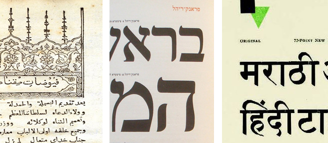
Written (and illustrated!) for design educators, students, and practitioners, this book contextualizes this long-lasting and still-present form of typographic expression. It’s difficult to find accessible historical context for images like these, though specialized collections hold relevant scholarly journals and limited-run books. As a design educator, my priority is access to practice-relevant historical and critical context. This book exists to share that access with a wider public audience. One of my priorities right now is expanding the image library to include global alphabets; the one my students and I read and write is the Latin alphabet, but many others exist, and some (like Arabic, Chinese, and Cyrillic) are very widely used today. It’s difficult but rewarding to find specimens produced locally, for and by audiences who use/d these alphabets for everyday communication. The process has ongoing for years; the details above are snippets from my digital archives research: a 1732 treatise on magnetism published by Ibrahim Müteferriqa in Istanbul, a stop along the way in my search for a locally-produced Arabic alphabet specimen; a page from Berthold’s 1924 specimen of Hebrew types, designed for the then-flourishing local Jewish community in Germany; and a page from a 1930 Gujarati Type Foundry specimen, printed in Bombay around 1930. It’s exciting to connect the visual research taking place in today’s graphic design studios with a diverse and (for most novice designers) as-yet unknown global history of typographic practice.
The photo details in this post show less than 10% of the following publicly available images: Nick Sherman’s Creative Commons image shared under this license, a detail of this Wikimedia Commons image, and a detail from this Pinterest post.
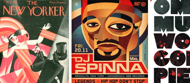
Cubism applied to jazz (1926) and the Hip Hop aesthetic (21st century).
One of the graphic design projects I most enjoy teaching is a book design project where students collaborate to write brief introductory texts for assigned time periods in the history of graphic design, then source images to illustrate the texts and create an editorial slant of their own. Naturally, they also design the book itself, and we use a print-on-demand service to produce the 36-page books. Otherwise generic texts can be curated to show how graphic design and fashion design overlap, how women have been active in graphic design, how astronomers have used graphic design strategies to visualize the universe, or how restrictive the history of Euro-American design really is when contextualized globally. When I presented this project and a cross-section of its results as a case study at a conference, looked back over past iterations and reflected on what I learned from them. One of my all-time favorite results is a 2018 student book showing how Black designers create dialogues with the history of graphic styles through the posters and album covers they design for contemporary hip-hop music. Teaching is a learning experience, and that’s why I love it. I constantly seek ways to diversify the projects I assign and the examples I show to be reflective of my students, their experiences, and the global community in which we live. But though my introductory lecture asked students to reflect (among many other things) on why images by Black designers don’t show up in generic histories of design, I never would have imagined this specific concept as a potential example of the “graphic histories” book project and I learned so much from the student who did.
About the images: 1926 New Yorker cover deploys the Cubist style. DJ Spinna fan art poster is by prop4g4nd4 on DeviantArt. Omar Musa’s World Goes to Pieces album was released by OBM Music in Australia, 2010.
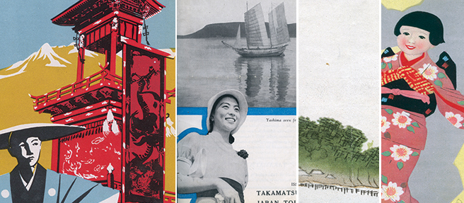
Montage of image details from JTB guidebook covers of the 1930s.
It’s thrilling to share this link to the abstract for my article “How to See Japan” in the Journal of Design History. Fellow academics (and any other interested readers) are welcome to get in touch for a PDF of the article itself, which I’m allowed to share on an individual basis but not through online links or social media posts.
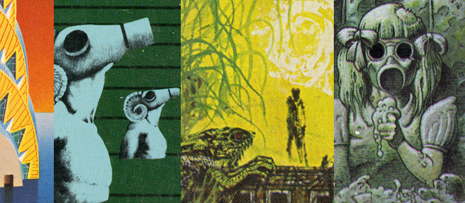
Montage of details from eco-dystopian novel covers of the 1960s-70s.
“Visualizing Eco-dystopia” is published in the journal Design & Culture (2018). Here’s the abstract: “This study examines the cover designs of popular works of eco-dystopian speculative fiction, documenting how graphic designers and commercial illustrators have conceptualized the impact of human behaviors on the near-future environment. The sample includes 105 covers for ten high-impact, mass-market novels written between 1962 and 2013. Coded for thematic similarities, the sample reveals visual strategies and narrative tropes that have recurred since the advent of contemporary eco-dystopian fiction in the 1960s. Yet evolving social and environmental conditions render the specific visual motifs more journalistic than anticipatory. Re-conceptualizing eco-dystopia through the meta-language of design failure, however, can be a way to suggest both genre-specific continuity and emergent concerns.”
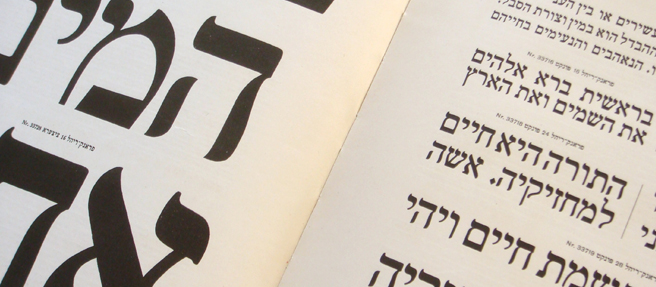
As the guest editor for a special issue of the visual communication design journal Visible Language, I centered the histories of designers, artifacts, practices, and global design communities that have been relegated to the periphery of disciplinary dialogues in western Europe and North America for far too long. During this process, I discovered that I love editing for one of the same reasons I love teaching: it’s a chance to learn something entirely new about the practice and history of design. Throughout the long editorial process, I remained an eager student of the authors I worked with. Through this editorial adventure, I’ve learned about the history of typography and design in places where the local languages are Arabic, Danish, Hebrew (pictured), and Māori. The remaining details can be explored in the issue, volume 53:1.
The photo in this post is a detail of Nick Sherman’s Creative Commons image shared under this license.
Japan Imperial Government Railways guidebook, 1915
“How to See Japan” is forthcoming in the Journal of Design History. Here’s its official abstract: The interwar English-language guidebooks published by the Japan Tourist Bureau utilized a diverse set of graphic design strategies on their front covers to communicate the cultural identity of Japan to anglophone tourists. Many of the covers borrowed the aesthetic conventions of European Modernism, rendering the Japanese landscape and its inhabitants familiar to the western tourist gaze. Conversely, others evoked the visual conventions of traditional Japanese painting and printmaking, signifying the exotic nature of Japanese tourism destinations. Adapted from both indigenous and imported visual languages, the JTB’s combination of graphic communication strategies functioned to construct a visual identity diverse in its component parts but cohesive in its over-arching received narrative. For anglophone viewers, the images depicted Japan as a destination simultaneously historical and modern, familiar yet exotic.
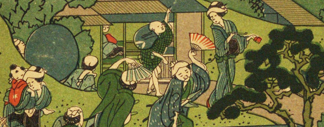
A Fashionable Melange of English Words, Kamekichi Tsunajima, 1887 (source).
At the AIGA Design Educators Community conference this June, I’m facilitating a workshop on using digital humanities resources to teach global design history. It can be tricky to find English-language, open-access sources that offer both high-quality reproductions and useful context for images that aren’t in your typical survey textbook. Though it’s not usually what I post about here, I’d like to share a few of the resources I use in both the studio and the design history classroom. Many sources mentioned here have decent-to-excellent coverage of the usual kinds of images from western Europe and North America that get covered in design history surveys; I make note of which additional global locations I’ve had good luck with at each source, if the archive’s name doesn’t make this information evident.
The Public Domain Review is a not-for-profit Open Knowledge project that collects and reviews (among other things) images that are in the public domain. In addition to showing images and providing introductory information about their production and meaning, the site links to the organizations and archives that house the originals and/or host the digital copies. I’ve found some unusual Chinese and Japanese sources here, and this is an excellent site for sourcing images to use in studio design projects that explore historical subject matter, since everything is in the public domain.
Monoskop is a collaborative wiki that focuses on arts and humanities. Their digital collection of Avant Garde magazines is especially fabulous, and it includes full runs of early Modernist publications from Japan, eastern Europe, and Central/South America, as well as all of the familiar publications from France, Germany, Russia, the Netherlands, and Italy. Some scans are housed on-site, like the amazing Mavo from Japan; other publications are viewed via links to repositories like the Asia Art Archive or Biblioteca Brasiliana.
The David Rumsey Historical Map Collection has thousands of very high-resolution, mostly public-domain geographical images. In addition to maps, this vast collection includes a surprising number of images graphic designers would call “infographics,” mostly from atlases. The collection is highly searchable (by maker, date, location, printing method) and the metadata is generally excellent. Though the collection is heavy on western European and North American cartographers, there’s growing representation for other geographical regions, particularly in the twentieth century.
The Qatar Digital Library is a collaboration between the British Library and the Qatar National Library, and it includes not only images but also audio, video, and featured articles. While most of the digital images can also been seen on the BL site, the QDL site makes it much easier to focus a search on the Persian Gulf region. The object descriptions are sometimes longer and more useful than those you’d get through a typical BL catalog search; they’re also often written by librarians and curators at the QNL. There’s good representation for illuminated manuscripts and maps, and some coverage for commercial illustration, newspapers, and printed books.
The Endangered Archives project at the British Library provides online access to physically endangered archival material from around the world. The interface sorts the materials into geographic regions: Africa, Americas, Asia, Europe, and Oceania. Item descriptions for the contents within individual projects are concise and easy to locate; there aren’t image thumbnails, which makes it time-consuming to browse visually. It’s worth the effort, though. The collection is incredibly diverse, ranging from seventeenth century Islamic manuscripts made in Ethiopia to magazines from Mongolia in the 1990s.
50 Watts is an excellent blog about book design and illustration. It’s browsable by location, date, and subject. Subjects range from textbook covers in 1920s Japan to mid-century Guatemalan illustration for children and information about each source is (usually) very specific and complete.
Japan’s National Diet Library digital collection includes books, periodicals, rare books and manuscripts, and various multi-media items (films, sound recordings). It’s searchable in English, though sometimes it can be difficult to find information beyond the basics of title/maker/date.
Between the two world wars, the Japan Tourist Bureau invested significant resources in encouraging in-bound international tourism. In particular, the JTB wanted to attract American and British tourists to Japan, and to do this, they issued posters, maps, and guidebooks (like the 1926 guide to Japan pictured in the detail above). The designers of this promotional literature used a variety of visual strategies to make sure viewers would see Japan as both comfortably familiar and excitingly foreign. The images quoted both avant-garde Modernism and traditional Japanese visual arts. At the moment, I’m putting the finishing touches on a paper I’ll deliver at the College Art Association’s upcoming annual conference in February. I’m looking forward to getting feedback on this new-to-me area of research. Though not pictured here, typography plays a significant role in this project, as well.
Today I spent time with William H. Page’s Specimens of Chromatic Wood Type, published in 1874 for use by Page & Company sales reps (catalog record here). Since every color had to be printed individually, producing the specimen was a labor-intensive task indeed. For readers who have seen the film “Type Face,” the Hamilton Company bought out Page & Company in 1891. This book is absolutely breath-taking and extremely rare. I’ve been saving it as a grand finale to my amazing time here at the Cary Collection, and it did not disappoint.
This masthead is from a 1929 Monotype publication full of short articles about how to be a better typographer. First, of course, it’s essential to use a Monotype casting machine. But there are other ways to improve as a designer, too. Be sure to stay current with the printed samples Monotype mails out to its customers on a regular basis. These show the latest trends in advertising and publishing as demonstrated by expert “type-men.” And don’t forget that Monotype’s San Francisco branch office is licensed to distribute types by Continental Type Founders, importers of the finest European fonts from Old World foundries. American fonts simply aren’t as fresh and sophisticated, while European fonts will lend “enchantment” to your work.
The American type foundry Barnhart Bros. & Spindler may have been fairly short-lived (it was founded in 1873 and bought out by American Type Founders in 1911, though it remained in business under its own name another 22 years after ATF purchased it) but it published some beautiful specimen books. During the nineteenth century, most of these were stout volumes with hundreds of pages. But by the early 1920s, when this beauty was produced, BB&S was releasing slender booklets devoted to a single typeface or a small, thematic selection of faces. This detail is from the cover of one such booklet that showcased “Modernistic and Extraordinary Typefaces.” With names like Cubist Bold, Old Dutch, Japanet, and Bamboo, the faces were guaranteed to give contemporary ads that much-desired, of-the-moment edge.
In 1900, the newly-consolidated American Type Founders released a book of “embellishments and ornamentations for the printer and publisher,” among which was this splendid piece of design. (Curious readers can see the book’s catalog entry here.) Hidden among the hundreds of pages of sickeningly sweet cherubs, faithful fidos, fragrant flowers, and star-spangled banners, there are some wonderfully wry and sarcastic images like this one. I’ve had a great deal of fun imagining the back-story here; I’d like to think the princess, having glimpsed the end of the tale, is getting ready to pack her bags and escape a life of uncomfortable shoes and high-handed princes.
In 1928, Frederic Warde designed a book showcasing printer’s ornaments for Lanston Monotype of London (catalog record here). Warde used Monotype’s existing, and extensive, collection of “printer’s flowers” to compose decorative frames and patterns. Most of the book featured typography in combination with the various borders and flowers, with title pages figuring prominently in the display. But the last few pages were colored paper printed only with patterns designed from the ornaments. Their sole purpose was to be beautiful. Frederic Warde had been married to Beatrice, soon to be of “Printing Should Be Invisible” fame, during the first part of the decade. Fortunately, he did not heed her advice when designing his Printer’s Ornaments.