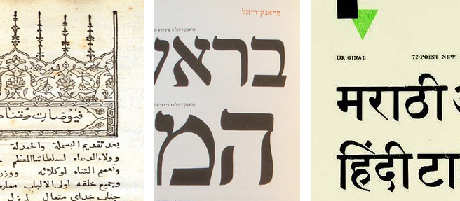
Written (and illustrated!) for design educators, students, and practitioners, this book contextualizes this long-lasting and still-present form of typographic expression. It’s difficult to find accessible historical context for images like these, though specialized collections hold relevant scholarly journals and limited-run books. As a design educator, my priority is access to practice-relevant historical and critical context. This book exists to share that access with a wider public audience. One of my priorities right now is expanding the image library to include global alphabets; the one my students and I read and write is the Latin alphabet, but many others exist, and some (like Arabic, Chinese, and Cyrillic) are very widely used today. It’s difficult but rewarding to find specimens produced locally, for and by audiences who use/d these alphabets for everyday communication. The process has ongoing for years; the details above are snippets from my digital archives research: a 1732 treatise on magnetism published by Ibrahim Müteferriqa in Istanbul, a stop along the way in my search for a locally-produced Arabic alphabet specimen; a page from Berthold’s 1924 specimen of Hebrew types, designed for the then-flourishing local Jewish community in Germany; and a page from a 1930 Gujarati Type Foundry specimen, printed in Bombay around 1930. It’s exciting to connect the visual research taking place in today’s graphic design studios with a diverse and (for most novice designers) as-yet unknown global history of typographic practice.
The photo details in this post show less than 10% of the following publicly available images: Nick Sherman’s Creative Commons image shared under this license, a detail of this Wikimedia Commons image, and a detail from this Pinterest post.
