I investigate visual narratives in popular print media, revealing how design contributes to place-based histories, culturally specific identities, and networked systems of visual exchange.
Through research, writing, and design, I seek to expose the multi-vocal layers and socially constructed imaginaries embedded in everyday images. Specifically, I document and interrogate narratives around 1/ cultural tourism in or consumed by the USA and 2/ public policy that’s informed by cultural identity as depicted in popular media. My research emerges from images, expanding the audience for my work through visual engagement and wide accessibility. In addition to researching and writing about popular visual culture, I also write and speak about design history pedagogy. In particular, I examine how and why design should seek equitable, global, praxis-driven narratives of our disciplinary history. At conferences and in print, I’ve explored teaching the complex global contexts of graphic design practice in the studio and the design history classroom at all levels of university education. Visit my CV for a full list of peer-reviewed publications and conference presentations.

Type Specimens
Pre-order from Bloomsbury Academic (2022)
This book began taking shape during a summer 2015 fellowship at the Rochester Institute of Technology’s Cary Collection. In the typography studio, my students and I often discuss the need for an accessible and image-rich resource for learning about the history and disciplinary context of the type specimen, a project most design students encounter at some point during their studio education. But there aren’t any introductory resources for designers and educators who want to put this still-popular form into a global historical and professional context. This book aims to fill that gap. Richly illustrated, with a visual glossary running in the margins and thematic chapter timelines, the text explains how the designers, makers, and users of type have visualized what “good typesetting” means since the introduction of the practice to Western Europe.
As a design educator, my priority is access to practice-relevant historical and critical context. I wrote and designed this book to share that access with a wider public audience. One of my priorities has been including global alphabets in the image library; my students and I typeset the Latin alphabet, but many others exist, and some (like Arabic, Chinese, or Cyrillic) are used extensively today. It’s difficult to find specimens produced locally, for and by audiences who use/d these alphabets for everyday communication. But it’s been rewarding, fun, and educational too.
Images from the author’s design sketches for the printed book.
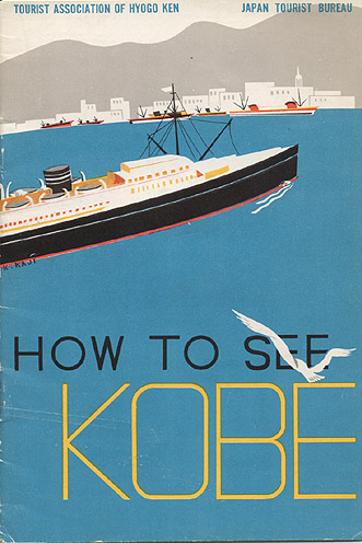
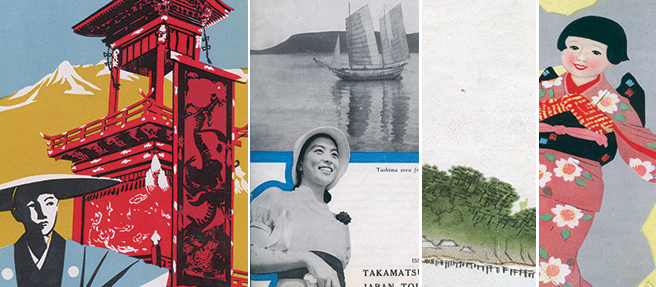
See Japan
Journal of Design History (31:4, 2018)
The interwar English-language guidebooks published by the Japan Tourist Bureau utilized a diverse set of graphic design strategies on their front covers to communicate the cultural identity of Japan to anglophone tourists. Many of the covers borrowed the aesthetic conventions of European Modernism, rendering the Japanese landscape and its inhabitants familiar to the western tourist gaze. Conversely, others evoked the visual conventions of traditional Japanese painting and printmaking, signifying the exotic nature of Japanese tourism destinations. Adapted from both indigenous and imported visual languages, the JTB’s combination of graphic communication strategies functioned to construct a visual identity diverse in its component parts but cohesive in its over-arching narrative. For anglophone viewers, the images depicted Japan as a destination simultaneously historical and modern, familiar yet exotic.
This research emerged from a discovery in a digital archive, tangentially related to the work I was doing at the time on the visual language of illustrated cartography and domestic tourism in the USA. I first presented it at the College Art Association conference (2017), where helpful audience questions prodded me to consider not just the stories visual tropes tell, but how the tropes themselves travel. This project shifted the trajectory of my research agenda to include global networks of visual-cultural exchange.
Images from the JTB’s late 1920s and early 1930s guidebooks to Japan, now in the public domain.


Visualizing Eco-dystopia
Design & Culture (10:3, 2018).
This study examines the cover designs of popular works of eco-dystopian speculative fiction, documenting how graphic designers and commercial illustrators have conceptualized the impact of human behaviors on the near-future environment. The sample includes 105 covers for ten high-impact, mass-market novels written between 1962 and 2013. Coded for thematic similarities, the sample reveals visual strategies and narrative tropes that have recurred since the advent of contemporary eco-dystopian fiction in the 1960s. Yet evolving social and environmental conditions render the specific visual motifs more journalistic than anticipatory. Re-conceptualizing eco-dystopia through the meta-language of design failure, however, can be a way to suggest both genre-specific continuity and emergent concerns.
The Sheep Look Up, cover illus. by Murray Tinkleman, is archived at ISFDB.
Posters for Public Health
Journal of Communication Design (3:2, 2016)
During the same years they were designing the now-famous American travel posters, Work Projects Administration (WPA) designers produced an extensive body of public health posters to communicate a variety of health-related messages to the American public. This article explores the role of the WPA’s public health posters in Depression-era health care dialogues in the USA. Explicitly, this visual dialogue centered around the need for data-driven personal health choices; reliance on expert information about health and disease; and the role of government agencies as representatives of reliable health data. Implicitly, the posters also re-enforced existing norms associated with race, gender, and class, framing dialogues that had as much to do with social conventions as they did with health care messaging. Drawing on the Library of Congress collection of WPA posters as its sample, this article provides both quantitative and qualitative analysis of the visual messaging strategies employed by WPA poster artists when discussing public health.
WPA posters (1930s-1940s) from the Library of Congress collection.


Gendered Geographies
“The British Isles for Boys & Girls” in Literary Tourism and the British Isles (ed. LuAnn McCracken Fletcher; Lexington Books, 2018)
During the late nineteenth century, educational travel literature for young Americans pictorialized geography via numerous illustrations in books with lush chromolithographic covers. This chapter analyses gendered approaches to depicting pedagogic tourism of the British Isles through cartographic illustration. It considers books from two successful series by Boston publisher Estes and Lauriat: the Three Vassar Girls by Vassar graduate Elizabeth Champney and the ZigZag Journeys by newspaperman and platform speaker Hezekiah Butterworth. While the illustrations for both series share many formal aesthetic properties, they also differ in their conceptual approaches to visualizing the tourist landscape. This paper explores the ways in which the books’ illustrations constructed a geographic imaginary of England, Ireland, Scotland, and Wales for their gender-specific reading audiences.
Front covers of Estes & Lauriat titles are in the public domain.
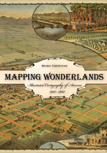
Mapping Wonderlands
Published by University of Arizona Press (2013)
Mapping Wonderlands is my first book, based on the dissertation research I undertook during my PhD in design history, theory, and criticism at Arizona State University. It explores popular, illustrated sight-seeing maps of Arizona during the first half-century of statehood (1912-62). Chosen as a Southwest Book of the Year, this richly illustrated book investigates how imaginary geographies influence our contemporary experience of tourism destinations and their received histories.
Front cover features a bird’s-eye view of Phoenix by itinerant mapmaker CJ Dyer (1885)
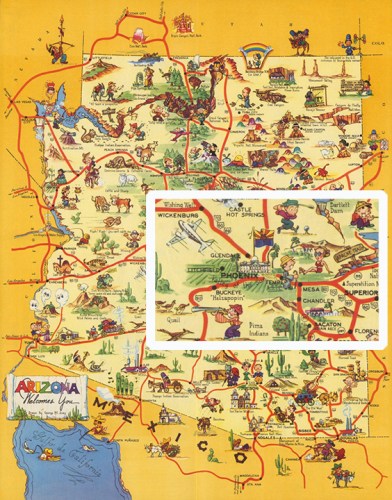
Arizona Highways
Journal of Arizona History (52:3, 2011)
“George Avey, Arizona Highways, and Popular Cartography” documents the role Avey played in establishing the cartographic imaginary of Arizona’s tourism landscapes. As the popular magazine’s art director, Avey curated maps, photos, and illustrations to tell Arizona’s story of cowboys and Indians, desert plants and wildlife, dude ranches and national parks, and verdant gardens springing up in the middle of barren sand. His own contributions were largely in the form of illustrated cartography, and he was instrumental in establishing the conventional visual vocabulary that subsequent mapmakers used to describe Arizona.
Pictured: “Arizona Welcomes You” by George Avey, Arizona Highways, 1939.
Beautiful Geography
Imago Mundi (69:2, 2017)
This paper explores the career of Ruth Taylor White, an American cartographic illustrator who published a significant number of pictorial maps from the 1920s into the 1940s. Taylor White’s cartographs (as she called them) were characterized by her signature bobble-headed cartoon characters who romped through colorful, attractive landscapes. These visually rich and highly narrative maps strove for historical, cultural, and geographic accuracy yet simultaneously engaged in profound stereotyping with regard to race, gender, and class. They reveal not only the aesthetic and conceptual preferences of their maker but also the cultural biases of their middle-class, white American audience.
Pictured: Hawaiian Islands, Ruth Taylor White, 1941.


Design & Doctoral Education
Dialectic (1:1, 2017)
University-level graphic design education in the United States continues to struggle with the question of what academic designation should constitute the terminal degree: the MFA, or a doctoral degree such as a Ph.D. or professional doctorate. This study 1/ gauges the contributions of graphic design educators to the scholarly literature around the topic and 2/ critically reviews a broad cross-section of the indexed literature. This reveals that the number of academics and professionals working in graphic design who have made significant contributions to this literature is negligible, in contrast to the number working in architectural, industrial, product, and interior design, as well as the fine visual arts. In conclusion, this study argues that university-level graphic design educators should be familiar with the existing literature on this subject since it affects the academic standards that frame and guide their career achievement metrics and accreditation. It calls for university-level graphic design educators to engage more fully in the continuing, inter- and trans-disciplinary conversations about doctoral education in design so that they might improve their abilities to contribute to the domains of knowledge that inform university communities, and, in so doing, advance their careers as they improve their students’ learning.
Image from Shrimpton’s Series of the Costumes of the Members of the University of Oxford, 1880.
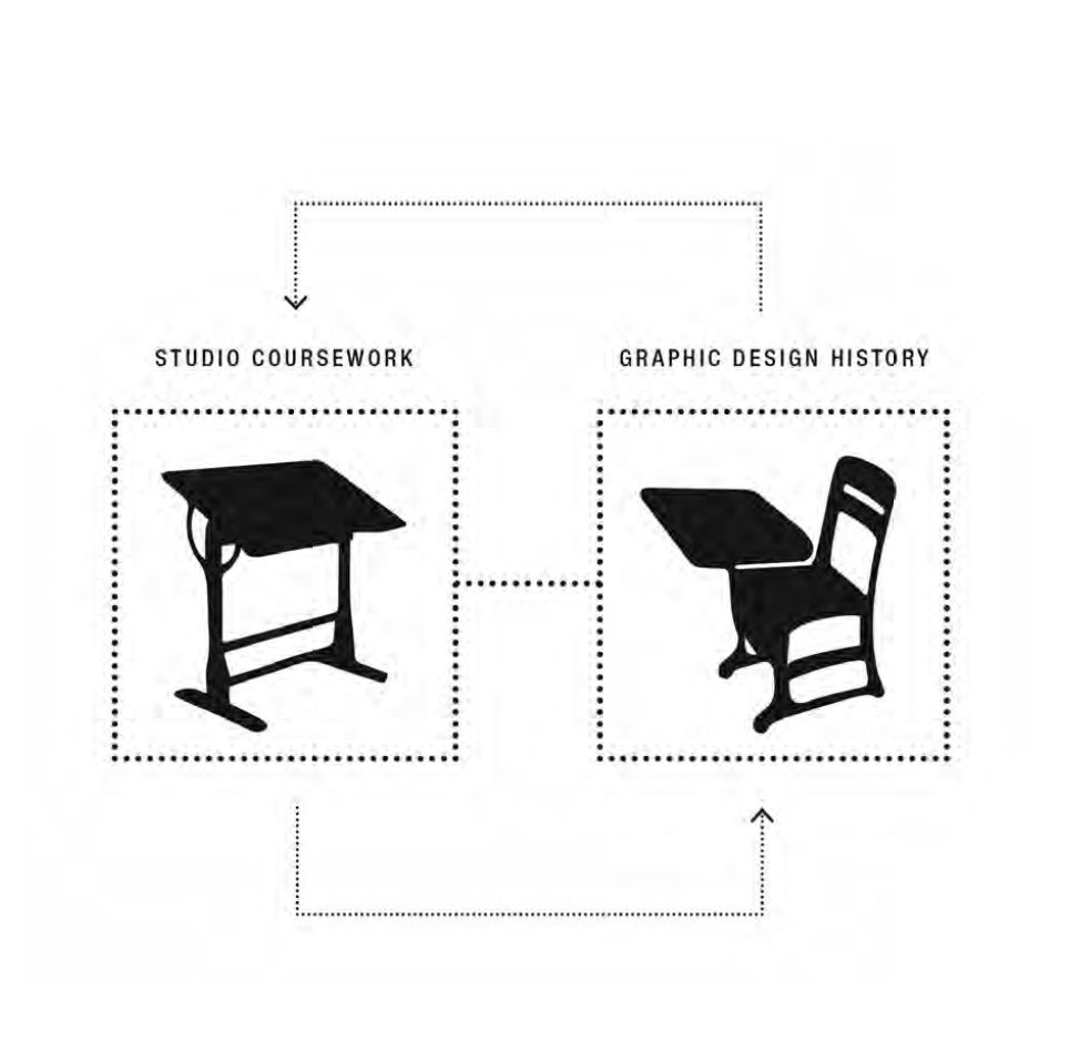
Just Making Things
Moving Beyond ‘Just Making Things’ in Visible Language (47:3, 2014)
The disciplinary literature of graphic design education calls for the inclusion of design history in studio students’ education. Yet evidence that the discipline has successfully answered this call remains scarce. This paper asks design educators to consider how our rhetoric might be misaligned with our practice on the subject of teaching graphic design history. It also asks educators to consider the need to develop an explicit, detailed body of case study literature dealing with the ways in which historical learning can be incorporated into the studio classroom. Design educators need to document and interrogate the specific ways in which we have been incorporating design history into the studio classroom. Enabling students to construct a functional model of design history requires more than a disparate and loosely defined set studio projects with history as their subject matter. Design educators need a way to learn about successful models and develop disciplinary best practices. Toward this end, the last section of this paper offers a detailed case study that documents one way to incorporate graphic design history into the studio classroom.
Image: visual abstract by the author.
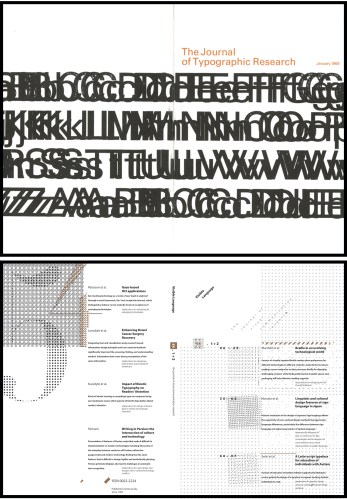
Critiquing the Canon
“The Role of Visible Language in Building and Critiquing a Canon of Graphic Design History” in Visible Language (50:3, 2016)
Throughout its first half-century of publication, Visible Language has contributed to the construction and deconstruction of a “canon” of graphic or visual communication design history. By including and excluding objects, practices, and makers from its literature, the journal has helped to establish a normative definition of what design history is and how it should function. The historical literature of Visible Language both participates in and, at notable moments, critiques a traditional canon: Eurocentric, male-dominated, artifact-focused, and professionally-oriented. This article views the historical literature of Visible Language through quantitative and qualitative lenses. Quantitatively, the article establishes how much of the journal’s literature is historical in content, what explicit purposes this literature serves for the discipline, and what areas of geographical and subject-matter emphasis emerge over time. Qualitatively, the article explores how this historical literature has influenced the conceptualization and practice of graphic or visual communication design history as an activity, how it has contributed to the self-conscious construction of the formal discipline, and how the existing literature has both shaped past developments and suggested as-yet unrealized future trajectories.
Image: the first and most recent digitally available covers of what’s now Visible Language
Teaching History
“Teaching Graphic Design History and Social Change” in Teaching Graphic Design History, ed. Steven Heller (Allworth, 2018)
This chapter guides fellow graphic design educators through how I structured and sourced open-access resources to use in an introductory survey course for first and second year majors and non-majors. The structure prioritizes understanding how design works within diverse places, times, and cultures— rather than a recognizing and recalling a chronology of visual styles and the famous men who applied them to design. Global case studies demonstrate the varying forms, functions, and philosophies that design might encompass design, exposing students to a range of historical and contemporary
Image: the front cover of Teaching Graphic Design History.

