

Read at Journal of Design History (31:4, 2018).
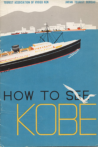
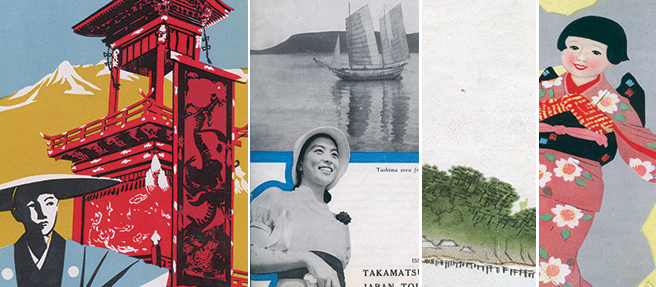
Abstract: The interwar English-language guidebooks published by the Japan Tourist Bureau utilized a diverse set of graphic design strategies on their front covers to communicate the cultural identity of Japan to anglophone tourists. Many of the covers borrowed the aesthetic conventions of European Modernism, rendering the Japanese landscape and its inhabitants familiar to the western tourist gaze. Conversely, others evoked the visual conventions of traditional Japanese painting and printmaking, signifying the exotic nature of Japanese tourism destinations. Adapted from both indigenous and imported visual languages, the JTB’s combination of graphic communication strategies functioned to construct a visual identity diverse in its component parts but cohesive in its over-arching received narrative. For anglophone viewers, the images depicted Japan as a destination simultaneously historical and modern, familiar yet exotic.
This research emerged from a discovery in a digital archive, tangentially related to the work I was doing at the time on the visual language of illustrated cartography and domestic tourism in the USA. I first presented it at the College Art Association conference (2017), where helpful audience questions prodded me to consider not just the stories visual tropes tell, but how the tropes themselves travel. This project shifted the trajectory of my research agenda to include global networks of visual-cultural exchange.
