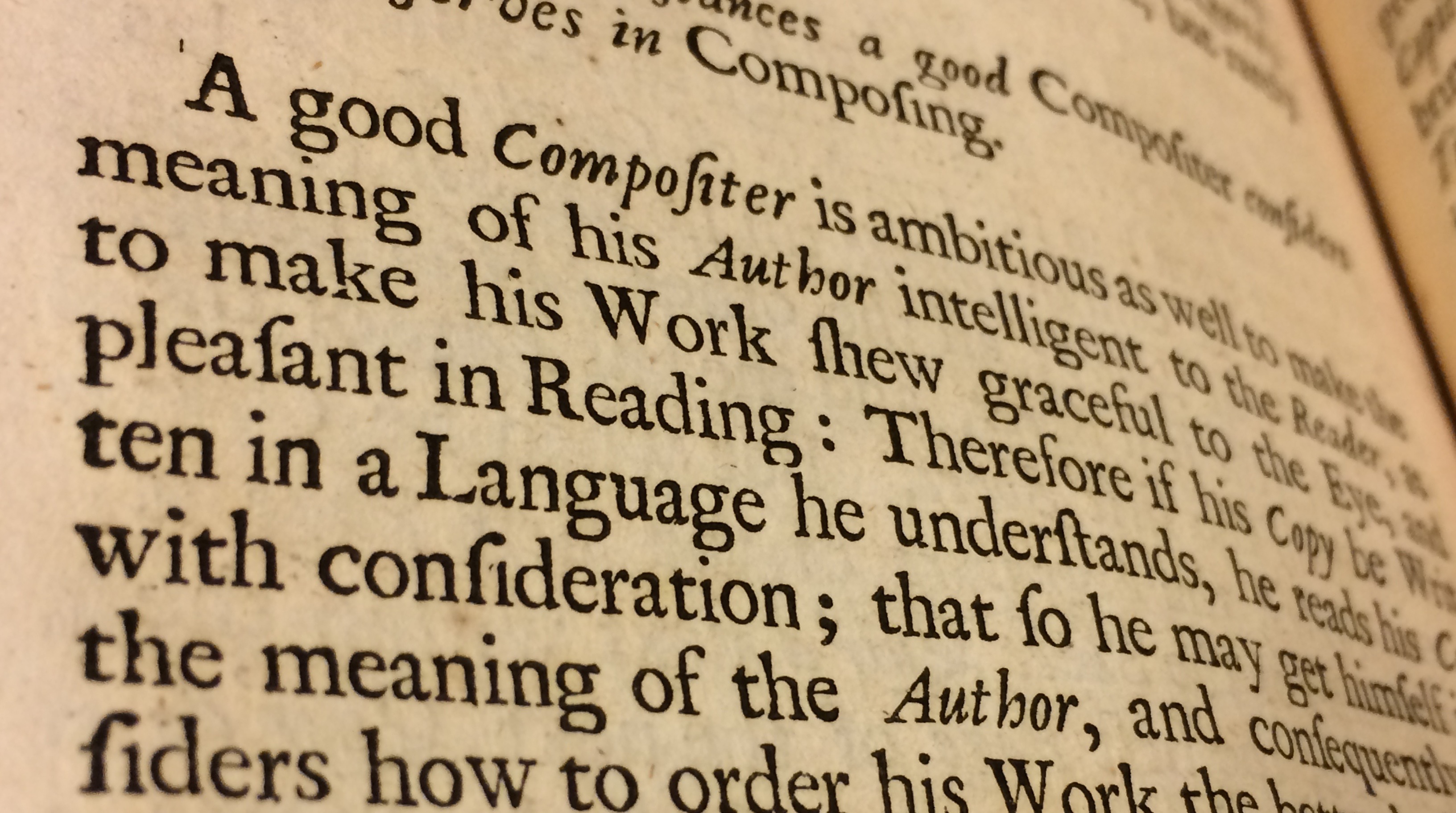
In 1683, in the first printer’s manual to be published in English, Joseph Moxon wrote that “A good Compositer is ambitious as well to make the meaning of his Author intelligent to the Reader.” In other words, the typographer serves the text, and the author. For modern (and Modernist) readers, this idea is most famously expressed in Beatrice Warde’s 1955 essay, “The Crystal Goblet: Or, Printing Should Be Invisible.” It’s an essay I read as a beginning typography student with hardly any skepticism at all, and one I sometimes assign to my own type students—though with an eye toward deconstructing it, and with plenty of skepticism on everyone’s part. Imagine my delight at encountering this maxim in a seventeenth century text, complete with long-s characters and quaint spellings, to say nothing of a generous approach toward capitalization. (Notice the long-s characters in the words compositer and pleasant—no, the typographer didn’t just run out of s’s and replace them with f’s.) This is one of the reasons I love research: learning unexpected things is fun.
